Basic Data Edits
With appropriate user rights, editing your asset information in the Metrix Asset Management system has been tailored to be super simple, and safe. To get started with editing your asset information, follow these steps:
-
Navigate to the main ‘Assets’ page and make a selection from the map screen.
-
Your asset and component data is displayed inside the info panel on the right-hand side of the page. This is where you will also edit the data.
-
To edit a field, simply click the information content - if the field is editable, and you have the appropriate privileges, the content will transform into an editable control. Depending on the field, users will be presented with one of the following controls:
Instructions on how to use each of the above controls are discussed below.
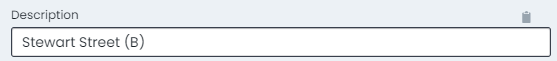
Text Input Box
-
For alpha-numeric free text fields, the control that renders when you set it to edit mode will be a standard input box.
-
To edit content in an input box, simply locate your cursor and begin typing.
-
Once you have finished making your edits, click anywhere outside of the box to release the control.
-
The edits you made are now STAGED and ready to save.
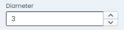
Number Input Box
-
For numeric data fields, the control that renders when you set it to edit mode will be a standard number input/picker box.
-
To edit content in an input box, simply locate your cursor and begin typing.
-
Another option you have is to click the increase/decrease toggles on the right-hand side of the input box.
-
Once you have finished making your edits, click anywhere outside of the box to release the control.
-
The edits you made are now STAGED and ready to save.
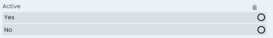
Option Row
-
For list based data fields that have fewer than 5 options, the control that renders when you set it to edit mode will be an option row.
-
To alter or set the active choice in the option row, simply click that option.
-
The edits you made are now STAGED and ready to save.
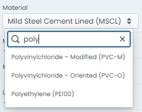
Drop Down List
-
For list based data fields that have more than 5 options, the control that renders when you set it to edit mode will be an drop-down list.
-
To alter or set the active choice in the option row, simply choose that option from the list.
-
The drop down list control also supports filtering of the visible list items. To do this, simply type your filtering letters into the search box at the top of the list.
-
The edits you made are now STAGED and ready to save.
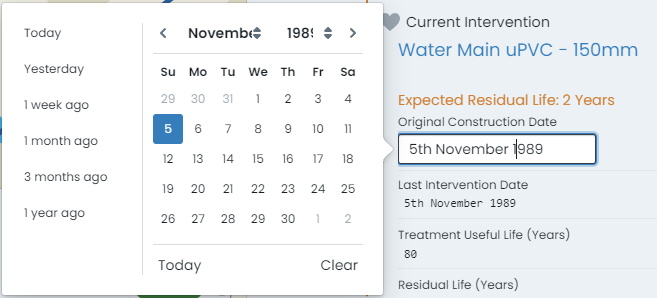
Calendar Picker
-
For date based data fields, the control that renders when you set it to edit mode will be a dynamic calendar control.
-
To edit content in a calendar control, simply choose the date value from the displayed calendar widget.
-
The calendar is month based. Users can change the visible month and year using the drop down options at the top of the control.
-
Some calendar controls are also pre-configured with ‘quick-dates’ allowing you to set the value to date such as ‘1 week ago’.
-
The edits you made are now STAGED and ready to save.