Info Panel Tools
This section discusses the following info panel tools that exist and/or can be used regardless of the specific info panel you are viewing at the time. These tools are situated above the core info panel sections and are always visible (whilst the info panel is open).
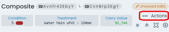
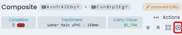
Actions Menu:
The ‘Actions’ menu contains a list of asset and component related actions that can be completed using
the system. Depending on the selected asset and/or the active component, various options in the actions menu
will be enabled and disabled.
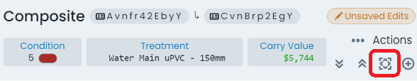
Zoom to component:
The ‘Zoom to Component’ button is located in the top-right hand corner
of the info panel, outside of any other content panels (i.e. component info panel, transaction
info panel, etc.). When clicked, the map window will pan and zoom to reveal the extents of the
active component.
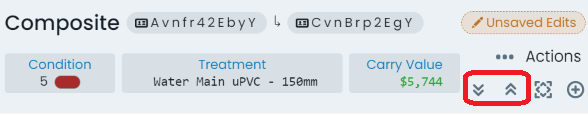
Panel expansion and collapse:
The expand and collapse options provide users with the ability
to collapse all of the info panel sections into flatter, header only, sections. This can be useful on smaller
resolution monitors, when looking for a certain section header. Conversely, the expand button will
display every info panel’s content.
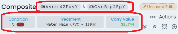
Shortcut pills:
The shortcut pills give quick and easy access to core data like condition,
carrying value, and ID values. Furthermore, clicking on the pill will take users through to the
appropriate info panel for further information.
Add to collection option:
The ‘Add to Collection’ tool allows users to include the selected/active
component in the current (or new, if none is current) collection set. Note: When the component is already
included in the collection set, this button will change to ‘Remove from Collection’.
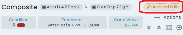
Edits Options:
When the selected/active component has been modified, this pill acts as a menu that
renders information about the data that has been modified (when clicked). Further to this, users can
revert any pending changes against the selected/active component by clicking ‘Rollback’ in this menu.
Classification Shortcut:
At the very top of the info panel, next to the classification label, exists a settings button that will take users through to the classification configuration page for the selected/active components classification.

Close Info Panel:
To close the info panel completely, simply click the ‘X’ icon in the top-right hand corner of the info panel.

Other Useful Info Panel Tools
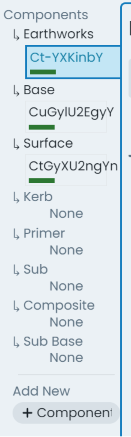
Component group switch:
On the left-hand side of the info panel is the active component switcher. This side panel displays all of the assets components, with the current active component highlighted. Users can simply click on a different component in this list to switch the info panel to displaying information about that component. Furthermore, this panel also lists component groups that exist on the asset classification definition, but do not have any assigned components.
Copy Field Values:
Throughout all of the info panels, on the right-hand side of any data field, users will find the ‘Copy Field Value’ button. This will put the value contained in the adjacent field into the users clipboard.
