Subsections of Info Panels
Component Info Panel
The component info panel displays information as it pertains to the selected/active component.
The component info panel has the tab title of ‘Info’. The following sections are included in the
component info panel.
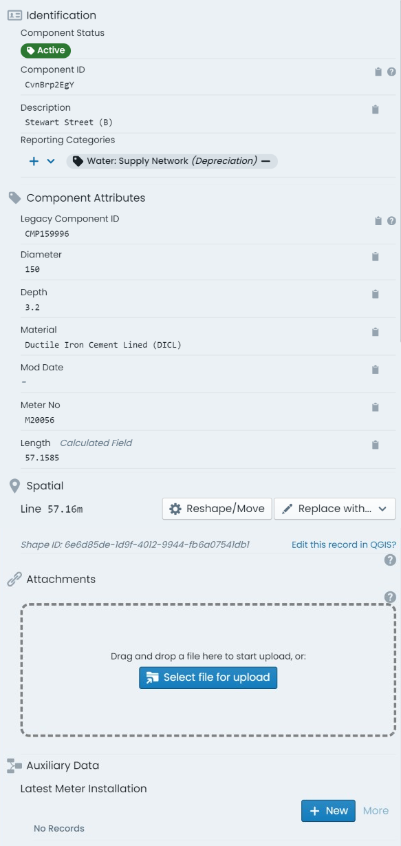
Identification:
Contains identifying information for the component including:
- Status: a tag indicating the current status code of the component.
- Component ID: the unique component ID for the component automatically set by the system.
- Barcode Value: any barcode value assigned to the component for in-field identification.
- Description: the brief description value set by end users for the component.
- Report Categories: an array of tags indicating any report categories/options assigned
to the component.
Component Attributes:
Renders the custom form definition assigned to the component’s
component group (if any). Each form field will be displayed in accordance with the
form definition’s layout specification.
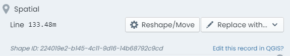
Spatial:
Provides basic information about the component’s underlying spatial feature as
well as access to tools to update or replace the geometry definition. Additionally,
the unique Shape ID value for the spatial record is displayed at the bottom of this section.
Attachments:
Displays a panel where users can interact with existing component
attachments and upload new attachments. Any existing attachments can be clicked on to view,
download, or manage. Users can also simply drag and drop files into this section to create
new attachments against the component.
Task Types:
Renders a list of task records attributed
to the component. Users can also create new task entry from this section.
Intervention Info Panel
The intervention info panel displays information as it pertains to the lifecycle metrics of the selected/active
component. The intervention info panel has the tab title of ‘Intervention’. The following sections are included
in the intervention info panel.
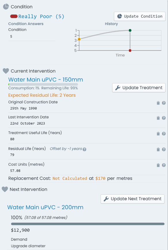
Condition:
contains information about the latest condition assessment for the component. Additionally,
a button (‘Update Condition’) is provided for updating the condition with a new assessment. Lastly, a graph displaying the
change in condition over time is presented for context.
Current Intervention:
contains information about the current state of the component including:
- Current Intervention Treatment: the current treatment definition assigned to the component.
- Original Construction Date: the date the component was originally commissioned.
- Last Intervention Date: the date the component last underwent capital intervention.
- Treatment Useful Life (Years): The number of years that the component is expected to be in service before
its next capital intervention.
- Residual Life (Years): The remaining service life of the component until its next capital
intervention is due. This includes any ‘Residual Life Offsets’ that may apply.
- Cost Units (UOM): The current cost unit value ascribed to the component. Note: The ‘UOM’ (unit of measure)
is defined by the assigned ‘Intervention Treatment’ definition - i.e. ‘metres’. In the case where a cost
unit formula is in force, this will be a read only field.
Additionally, this section contains a button (‘Update Treatment’) linking to a panel that allows users to update the current
intervention treatment.
Next Intervention:
contains information about any slated next intervention treatment definition. The recorded
intent and scope of the next intervention is detailed alongside a button (‘Update Next Treatment’) linking to a panel that allows users to update the next intervention treatment.
Transactions Info Panel
The transactions info panel displays information as it pertains to the financial transaction ledger of the selected/active
component. The transaction info panel has the tab title of ‘Transactions’. The following sections are included
in the transactions info panel.
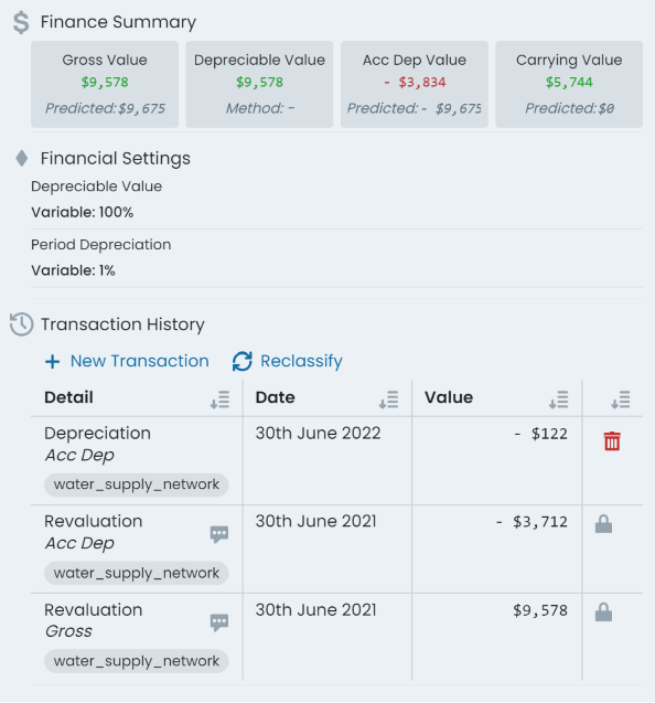
Finance Summary:
contains a snapshot of the current ‘Gross Value’, ‘Depreciable Value’, ‘Accumulated Depreciation
Value’, and the ‘Carrying Value’. These figures represent the financial position of the selected/active component
including all of its active financial transaction ledger postings.
Info
When an intervention treatment has been assigned to the component, and valid rates exist, the ’ value summary pills also
display a calculated value field based on the relevant rates and residual life.
Financial Settings:
provides an interface for users to view and manage the selected/active components depreciation
settings - which are optional and, presently, for information purposes only. Users can view/set the depreciable value
of the component as either a fixed value, or a percentage share of the components gross value. Likewise, users can set the
annual depreciation rate for the component as either a fixed value, or a percentage share of the components value.
Transaction History:
this sections provides a table view of every active financial ledger transaction posted
against the selected/active component. Each row details the transaction type, finance category, posting date, and
posting value of the entry. Additionally, each row has an option to delete the transaction posting (if permitted).
Info
The option to delete a transaction posting is only permissible in the following circumstances:
- The transaction is the most recent posting (top row of the table), and
- The transaction did not occur during a locked financial period.
Lastly, above the transaction history table, reside options to create new financial ledger transaction entries (‘New Transaction’)
as well as performing a financial reclassification (‘Reclassify’) of the component.
Programming Info Panel
The programming panel displays details on any mobile programmes that the selected/active component
is an item within. For each related programme, users are provided with an overview of the programme name,
due date, and current completion status.
Clicking on a programme item will bring up a panel providing additional information about the component
item within the programme.
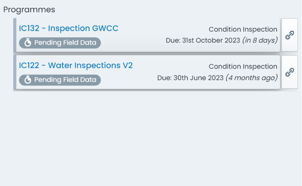
Beta Feature
Elements of the Programme system are still flagged as beta products. As such, some of the items and information
accessible through this panel are subject to change.
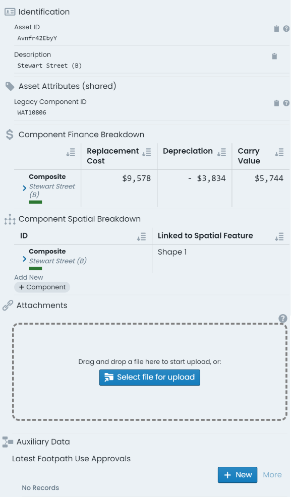
Parent Asset Info Panel
The parent asset info tab provides information pertaining to the parent asset of the selected/active
component. The parent asset info panel has the tab title of ‘Parent Asset’. The sections detailed below
are included in the parent asset info panel.
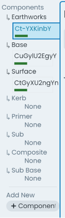
Example
Consider a road asset with three (3) components - earthworks, base, and surface. Each of the components
would have their own unique component info panel, intervention info panel, transactions info panel, and
programming info panel. That is, each time you change the active component, the information contained within
these panels will update to reflect the new entity.
The parent asset info panel is constant regardless of the active component. The information displayed on this
panel will only change when a different asset is activated. Likewise, any details edited on the parent
asset info panel will persist for any of the ‘sibling’ components across the asset. That is, the information
is shared.
Identification:
contains identifying information for the asset including:
- Asset ID: the unique asset ID for the asset automatically set by the system.
- Barcode Value: any barcode value assigned to the asset for in-field identification.
- Description: the brief description value set by end users for the asset.
Asset Attributes (shared):
renders the custom form definition assigned to the asset’s
classification (if any). Each form field will be displayed in accordance with the
form definition’s layout specification.
The ‘shared’ reference in the section’s header is simply communicating that the
information within this panel is shared across all child components of the asset.
Component Spatial Breakdown:
as each component within an asset can be defined by either
a common/shared geometry, or a distinct geometry to that component, the component spatial
breakdown provides a context for the spatial features used across the asset..
Attachments:
displays a panel where users can interact with existing asset
attachments and upload new attachments. Users can interact with existing asset
attachments and upload new attachments. Any existing attachments can be clicked on to view,
download, or manage. Users can also simply drag and drop files into this section to create
new attachments against the asset.
Task Types:
renders a list of task records attributed
to the asset. Users can also create new task record entries from this section.
This section discusses the following info panel tools that exist and/or can be
used regardless of the specific info panel you are viewing at the time. These tools are situated
above the core info panel sections and are always visible (whilst the info panel is open).
The ‘Actions’ menu contains a list of asset and component related actions that can be completed using
the system. Depending on the selected asset and/or the active component, various options in the actions menu
will be enabled and disabled.
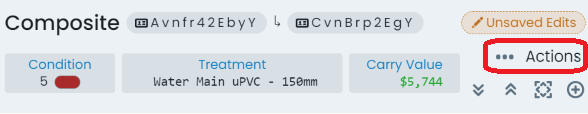
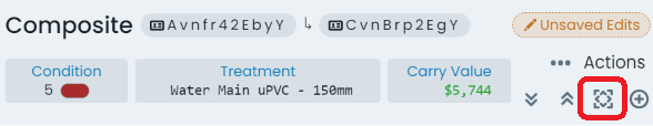
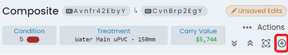
Zoom to component:
The ‘Zoom to Component’ button is located in the top-right hand corner
of the info panel, outside of any other content panels (i.e. component info panel, transaction
info panel, etc.). When clicked, the map window will pan and zoom to reveal the extents of the
active component.
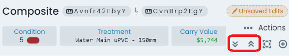
Panel expansion and collapse:
The expand and collapse options provide users with the ability
to collapse all of the info panel sections into flatter, header only, sections. This can be useful on smaller
resolution monitors, when looking for a certain section header. Conversely, the expand button will
display every info panel’s content.
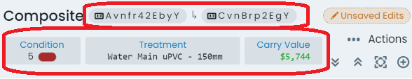
Shortcut pills:
The shortcut pills give quick and easy access to core data like condition,
carrying value, and ID values. Furthermore, clicking on the pill will take users through to the
appropriate info panel for further information.
Add to collection option:
The ‘Add to Collection’ tool allows users to include the selected/active
component in the current (or new, if none is current) collection set. Note: When the component is already
included in the collection set, this button will change to ‘Remove from Collection’.
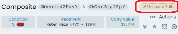
Edits Options:
When the selected/active component has been modified, this pill acts as a menu that
renders information about the data that has been modified (when clicked). Further to this, users can
revert any pending changes against the selected/active component by clicking ‘Rollback’ in this menu.
Classification Shortcut:
At the very top of the info panel, next to the classification label, exists
a settings button that will take users through to the classification configuration page for the
selected/active components classification.

Close Info Panel:
To close the info panel completely, simply click the ‘X’ icon in the top-right hand
corner of the info panel.

Component group switch:
On the left-hand side of the info panel is the active component switcher. This
side panel displays all of the assets components, with the current active component highlighted. Users can simply
click on a different component in this list to switch the info panel to displaying information about that
component. Furthermore, this panel also lists component groups that exist on the asset classification definition,
but do not have any assigned components.
Copy Field Values:
Throughout all of the info panels, on the right-hand side of any data field, users will
find the ‘Copy Field Value’ button. This will put the value contained in the adjacent field into the users clipboard.
